Cute Can Still Mean Inclusive: Behind the #BEspesh Collection
- Charley Jo Vaughn
- May 22
- 2 min read

Welcome to So Very Spesh.
🎧 Listen to the episode here: Episode 4
Somewhere along this journey, I accidentally became a graphic designer.
I spend a lot of time in Canva now -- probably more than I should admit -- but what started as experimenting with visuals has turned into one of my favorite parts of building Spesh.
Because for me, branding is never just about how something looks.
It's about how it feels.
And I've always believed that inclusion, advocacy, and accessibility deserve to feel warm, creative, and human -- not clinical or cold.
That's where the #BEspesh collection was born.
It's a show-build launch of designs rooted in belonging, representation, and everyday advocacy. Each piece carries meaning, but none of it is meant to feel heavy.
It's meant to feel like us.
The Heart of the Collection
The #BEspesh collection is rolling out in four categories:
Kid-friendly designs
Spesh Mom
Spesh Teacher
Spesh logo variations
Each one was created with intention, but also with joy. Because inclusion should be something people want to participate in.

Kid-Friendly Designs
You'll see phrases like:
"Let's Be Friends"
"Moving Helps Me Learn"
"You Can Sit With Us"
They're simple on purpose.
These designs aren't just for kids with disabilities. They're for any child, any classroom, any community.
They're about friendship. Belonging. And the quiet power of being included.

Spesh Mom Collection
This collection centers around the phrase:
"I'm not a regular mom, I'm a spesh mom."
It features everyday symbols like coffee cups, AAC devices, headphones, and wheelchairs -- not as hardship markers, but as real parts of daily life.
The goal was never to portray struggle.
The goal was to reflect identity, humor, pride and connection.

Spesh Teacher Collection
Educators are a huge part of this world, especially in special education spaces.
This line includes visuals like PECS cards, horseshoe tables, play therapy elements, AAC devices, and other familiar supports that teachers and therapists recognize instantly.
It's a nod to the people who show up every day and make inclusion possible in real classrooms.
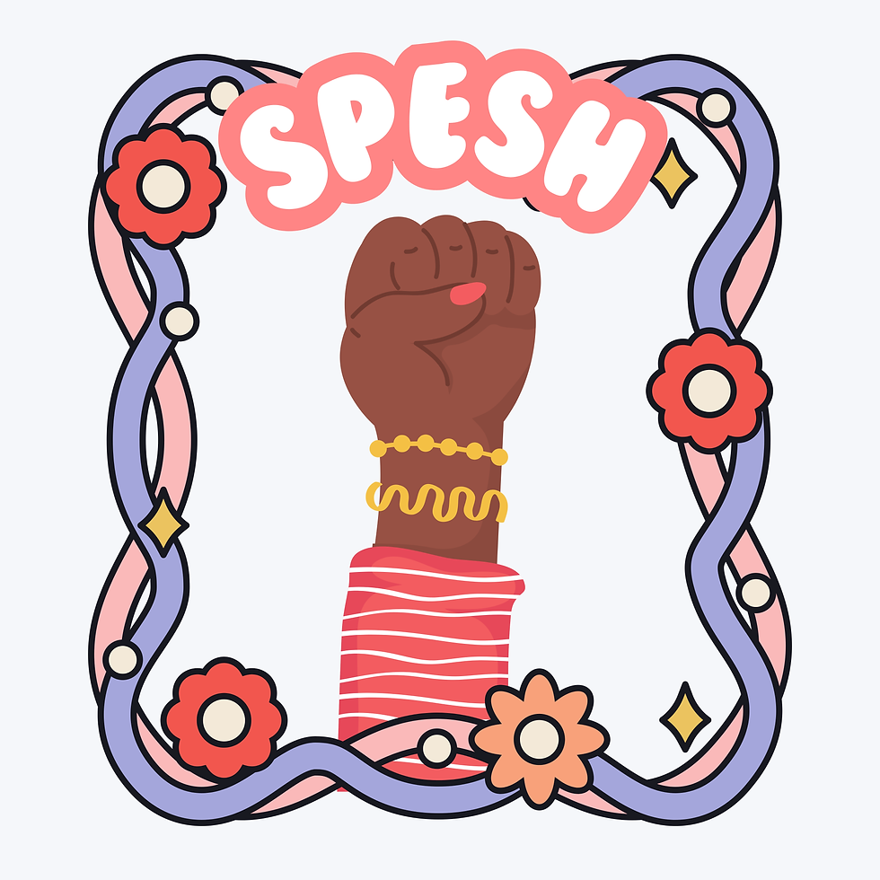
Empowerment Through Design
One of the most meaningful parts of this process has been reimagining the original Spesh logo.
The empowerment fist has always represented advocacy and visibility, but exploring new variations of it has allowed me to play with tone -- from bold to playful to minimal -- while keeping the same message at the center.
Why It Matters
Inclusion doesn't have to look serious to be serious.
A shirt that says "You Can Sit With Us" might seem simple, but it can completely shift how a child feels walking into a room.
Design has power.
Language has power.
And when the two come together intentionally, they can create belonging in everyday moments.
That's what #BEspesh is really about.
Not just clothing.
Not just branding.
But wearable advocacy.
Thanks for being here and growing with Spesh as it continues to evolve.
And as always... keep making the world so very spesh.


Comments